
The Art That Shaped My Vision: Discovering Robert McGinnis in the Stacks
The quintessential 'McGinnis Woman'—elongated, graceful, and mysterious against a monochromatic blue background. This painting demonstrates McGinnis's mastery of color, composition, and the implied narrative that made his female figures so memorable..
There's something magical about stumbling upon greatness in the most unassuming places. For me, that moment happened not in a gallery or museum, but in the dusty aisles of second-hand bookstores, pulling science fiction paperbacks, noir thrillers, and spy novels from overcrowded shelves. The covers stopped me cold—elongated figures of women who seemed to inhabit a world far more sophisticated than the pulp stories they adorned. I didn't know the artist's name then, but I knew I was looking at something extraordinary.
Those women—McGinnis women, as I'd later learn to call them—possessed something that transcended the typical femme fatale or damsel archetype. Yes, they were sensual and dangerous, with legs that seemed to stretch forever and poses that suggested both vulnerability and lethal competence. But it was their faces that captured me completely. These weren't generic beauties painted to sell books. Each carried an expression that implied an entire inner life, a personality that made them more than whatever role the story demanded—whether assassin, housewife, space adventurer, or innocent abroad.
The Master of Singular Vision
Robert Edward McGinnis didn't just illustrate stories; he created worlds with a brushstroke. Born in Cincinnati in 1926 and raised in rural Wyoming, Ohio, McGinnis's journey to artistic mastery began with encouragement from his father and Saturday morning drawing classes at the Cincinnati Art Museum. His path took him from a brief apprenticeship at Walt Disney Studios—interrupted by World War II and his service in the Merchant Marine—to Ohio State University, where he played left guard on the undefeated 1944 football team while studying fine art.
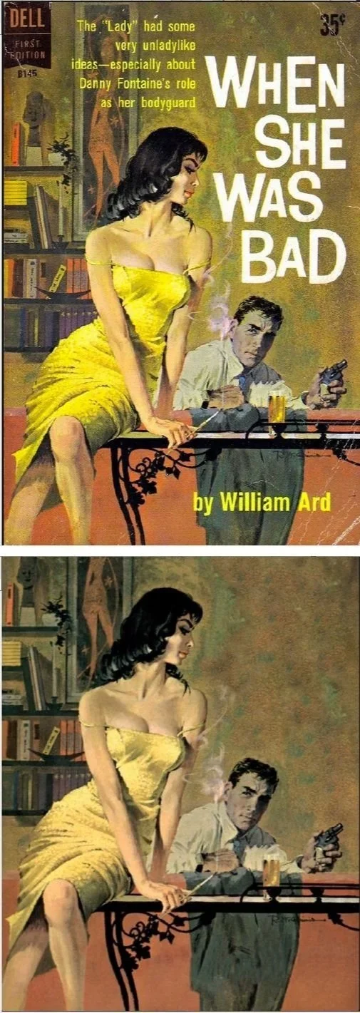
A classic Dell paperback cover by McGinnis showcasing 'When She Was Bad'—notice the elongated figure of the woman in the striking yellow dress, the monochromatic background, and the psychological tension between the characters that made his work so compelling on bookstore shelves
After moving to New York in 1953, McGinnis found his calling through a chance encounter with illustrator Mitchell Hooks in 1958, who introduced him to Dell Publishing. Unlike many illustrators who considered paperback work beneath them, McGinnis embraced these assignments with enthusiasm. "A lot of illustrators wouldn't do them—they were considered cheap and low-grade," he later reflected. "But I enjoyed doing them. I didn't see anything demeaning about it". wikipedia
What struck me most about McGinnis's work was his masterful use of color and space. Those singular, monochromatic backgrounds—rich greens, deep purples, blazing reds—didn't just place his figures in space; they made them leap off the page with an urgency that demanded attention. This wasn't accident but artistry. McGinnis understood that in the crowded marketplace of paperback covers, subtlety was the enemy of sales.
The Emotional Chameleon
McGinnis possessed a remarkable ability to modulate tone and emotion across genres. He could capture the breathless adventure of a spy thriller, inject just the right amount of camp into a science fiction romp, or plunge into the moral darkness where bad men conducted their business. His primary medium was egg tempera, which he made himself, though he also worked with gouache and oil paints throughout his seven-decade career. This technique gave his work a particular luminous quality that became part of his signature style. killercoversoftheweek.blogspot
His artistic process was methodical and professional, using photo references and a Balopticon projector similar to those employed by Norman Rockwell. But technique alone doesn't explain the McGinnis magic. What set him apart was his gift for imbuing static images with narrative tension and psychological depth. As art critic Charles Ardai observed, McGinnis's women were "leggy, serene, aloof, unruffled, coiled, and deadly or enigmatic and sensuous... like otherworldly creatures, breathtaking and perfect". gurneyjourney.blogspot
Defining an Era Before I Could See It
This split composition for 'Thunderball' showcases McGinnis's versatility—underwater action sequences blend seamlessly with beach glamour, defining the visual vocabulary of James Bond adventures for an entire generation.
Before I was old enough to watch a James Bond film, McGinnis had already defined 007 for me through his iconic movie posters. His work on "Thunderball" (1965), "You Only Live Twice" (1967), "On Her Majesty's Secret Service" (1969), and "Diamonds Are Forever" (1971) didn't just advertise films—they created a visual vocabulary for sophistication, danger, and glamour that influenced popular culture for decades.
Robert McGinnis's dynamic poster art for 'On Her Majesty's Secret Service' perfectly captures the film's blend of alpine adventure and deadly sophistication—Bond and his companion ski-chase their way through explosive danger with McGinnis's signature style.
But perhaps most thrilling to discover was McGinnis's connection to one of my all-time favorite films: Brad Bird's "The Incredibles." Learning that McGinnis created promotional artwork for this modern masterpiece felt like watching two eras of artistic excellence shake hands. His ability to capture each character's essential nature—their verisimilitude, as you might say—while maintaining that sense of excitement and wonder that makes great adventure stories sing, demonstrated that his gifts transcended any single genre or era.
The Breakfast at Tiffany's Phenomenon
McGinnis's transition to film poster art began with his iconic 1961 poster for "Breakfast at Tiffany's," featuring Audrey Hepburn in her classic black dress. Using his wife and family cat as models, McGinnis created what became one of the most reproduced images in history, though he never imagined its lasting impact. This poster perfectly encapsulated what would become the McGinnis aesthetic: sophisticated, alluring, and somehow both timeless and utterly of its moment. postercollector
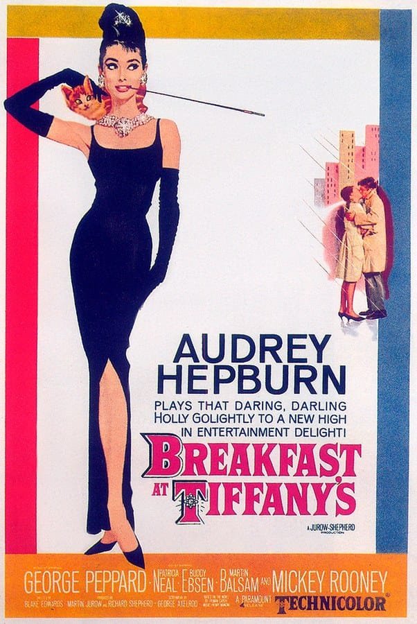
Robert McGinnis’s iconic illustrated movie poster for 'Breakfast at Tiffany’s'—featuring Audrey Hepburn as Holly Golightly—captures the elegance, glamour, and cinematic artistry that defined both the film and an era of poster design.
His film work extended to "Barbarella" (1968), featuring Jane Fonda in space-age attire, "The Odd Couple" (1968), and "Cotton Comes to Harlem". Each poster embodied what critics called the "loose, liberated visual style" of the swinging sixties while maintaining McGinnis's distinctive approach to character and composition. crimereads
Technical Mastery Meets Commercial Appeal
McGinnis's work represents something increasingly rare: the marriage of fine art technique with popular accessibility. His paintings demonstrate sophisticated understanding of composition, color theory, and human anatomy, elevated by his ability to imbue commercial illustrations with genuine artistic weight. Unlike many illustrators of his era, McGinnis consistently treated his subjects as individual portraits rather than generic figures. artcontrarian.blogspot
McGinnis's 'Barbarella' poster captures the 'loose, liberated visual style' of the swinging sixties while maintaining his distinctive approach to character and composition—science fiction filtered through sophisticated artistry. A film I’ve never actually seen! And, probably, never will.
His color palette was particularly sophisticated, characterized by what art historian Art Scott described as "dramatic use of bold one-color backgrounds: e.g., orange... and blue, almost monochrome". This approach created striking visual impact while serving the commercial purpose of making covers stand out on crowded bookstore shelves—including those second-hand shops where I first encountered his genius. crimereads
A Legacy That Continues to Inspire
Over his career, McGinnis produced more than 1,400 paperback covers and over 40 movie posters. His exceptional work was formally recognized in 1993 when he was inducted into the Society of Illustrators Hall of Fame. Even in his final years, McGinnis continued working daily in his Old Greenwich studio, remaining active almost until his death on March 10, 2025, at age 99. illustrationhistory
McGinnis occupies a unique position in my personal pantheon of artistic greats. He exists alongside the masters we're supposed to admire—your Rockwells and your Leyendeckers—but with the added dimension of having shaped popular culture in ways that reached beyond the art world into the everyday visual experience of millions. His influence appears in fashion photography, advertising design, and film aesthetics decades after his peak commercial period. roshnime
The Story Continues
What makes McGinnis's legacy particularly meaningful to contemporary illustrators like myself is how he elevated genre work through sheer excellence of execution and vision. He never apologized for working in commercial illustration, never treated it as a stepping stone to "real" art. Instead, he demonstrated that commercial work, approached with integrity and skill, could achieve artistic significance that outlasts its original commercial purpose.
Every time I approach my own illustration work—whether it's a narrative piece, a character study, or even a quick sketch—I carry with me something of what I learned from those dusty paperback covers. The understanding that personality trumps perfection, that color and composition can create emotion as powerfully as subject matter, and that great art often finds us in the most unexpected places.
Robert McGinnis taught me, without ever knowing it, that the best illustration doesn't just decorate a story—it tells one of its own. In a career that spanned seven decades, he never forgot that truth, and neither should we.